Fiat Logo History
文章節錄自:http://www.fiat.com/cgi-bin/pbrand.dll/FIAT_COM/news/news.jsp?contentOID=1074093165
1899
The "Fabbrica Italiana Automobili Torino" company is founded in
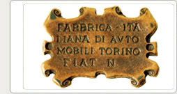
At the top left of the poster, the artist includes a small parchment containing the company name.
This very elaborate design eventually becomes the first FIAT logo.
"Fabbrica Italiana Automobili Torino" 公司創辦在Turin(都靈)
為了慶祝而創作了一張特別的海報。藝術家在海報的左上方放置了一張小羊皮紙寫上了公司名稱。
這個非常精心製作的設計最後成為第一個飛雅特的商標。
1901
FIAT decides to apply a proper logo on its cars: a small enamelled brass plate in the centre of which the name FIAT appears, with the characteristic A, which has remained practically unchanged up to the present day.
飛雅特決定申請一個適當的商標在它的汽車上: 一個上釉的小型黃銅名牌上有飛雅特的名字, 與一個有到目前為止尚未被改變設計的獨特字母A。

1904
The logo becomes oval in shape, taking on an original liberty style that continues to be produced until the 1920s.
商標變得橢圓形, 這個原創許可的式樣一直被製造到20年代。

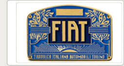
1925
The logo becomes circular, with the FIAT name in red on a white background.
The stylised laurel wreath around the outside is intended to celebrate FIAT’s victorious participation in the first competitive motor races.
商標變成圓形, 以紅色的飛雅特名字在白色背景上。風格化後的月桂樹花圈(桂冠)在外面, 意欲慶祝飛雅特參與賽事冠軍勝利。
1931
The automotive project begins to dominate even in terms of communication, and the logo, from being circular and richly detailed, suddenly becomes a rectangle taken up almost entirely by the FIAT name.
汽車項目開始控制根據通信, 並且商標從擁有複雜和圓形突然成為由飛雅特名字幾乎整個佔去的方形。

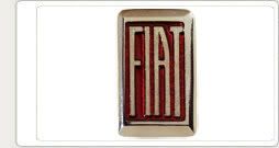
1932
The rectangular shape takes the form of a shield, a symbol rather more fitting for the radiator grilles on the new models. With a series of slight variations, this logo is used on FIAT cars up until 1968.
長方形採取盾的外型, 更適合搭配新車款的水箱造型。小幅修改的同系列商標被使用在飛雅特汽車上直到1968年。
1968
The logo featuring four blue rhombuses is adopted, a logo that was to become the main identifying element for the entire FIAT group.
這個採取四個藍色菱形為特色的商標成為整個飛雅特集團主要辨認元素。

1999
The brand’s 100th anniversary sees a return to the style of the logo from the 1920s.
The version chosen has a blue background, a chrome-plated logo, with the characteristic A, and a more stylised laurel wreath.
這百年品牌似乎重返到了20年代的商標風格。
這個版本選擇有藍色背景, 一個鍍鉻的商標, 與獨特設計的字母A, 和一個更加風格化的月桂樹花圈(桂冠)。
![]()
2006
The new FIAT logo is launched, seen for the first time on the Bravo, and set to be used on all future FIAT vehicles.
新飛雅特商標出版了, 第一次的出現是在Bravo身上, 並將被用在所有未來的飛雅特車款上。
All Fiat Logos![]()


留言